OIDA Image Collection
Filters:
Reset 
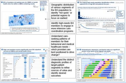
A collage of four different graphs and charts that provide information about the geographical distribution of the BH population. <br /><br />The first graph on the top left shows a map of the population of different regions of the United States with different colors representing different regions. The map is divided into different sections each representing a different region. The top right graph shows a line graph that shows the percentage of people who have been diagnosed with BH in different regions with the highest percentage being in the top right corner and the lowest percentage being at the bottom left corner.<br /><br />In the center of the image there is a title that reads "Geographic distribution of various regions of BH populations: identify high-needs BH members to engage in more intensive care coordination programs." Below the title there are several bullet points that explain the different regions and how they are related to the population. The bullet points are:<br /><br />- Understand care-seeking patterns of individuals for their behavioral and medical healthcare needs which providers are best positioned to drive change and understand the distinct diagnostic profiles of target patient segments to refine sources of value and outcomes. The chart also includes a legend that explains the colors used in the graph.

Description Generated using AI

A collage of four different graphs and charts that provide information about the geographical distribution of the BH population.

The first graph on the top left shows a map of the population of different regions of the United States with different colors representing different regions. The map is divided into different sections each representing a different region. The top right graph shows a line graph that shows the percentage of people who have been diagnosed with BH in different regions with the highest percentage being in the top right corner and the lowest percentage being at the bottom left corner.

In the center of the image there is a title that reads "Geographic distribution of various regions of BH populations: identify high-needs BH members to engage in more intensive care coordination programs." Below the title there are several bullet points that explain the different regions and how they are related to the population. The bullet points are:

- Understand care-seeking patterns of individuals for their behavioral and medical healthcare needs which providers are best positioned to drive change and understand the distinct diagnostic profiles of target patient segments to refine sources of value and outcomes. The chart also includes a legend that explains the colors used in the graph.

We encourage you to view the image in the context of its source document(s) and cite the source(s) when using these images. However, to cite just this image alone, click the “Cite This Image” button and then paste the copied text.
Information copied to your clipboard:

"A collage of four different graphs and charts that provide information about the geographical distribution of the BH population.

The firs...