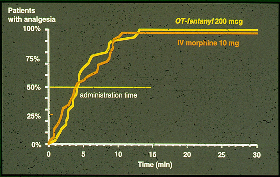
A line graph that shows the number of patients with analgesia in the United States. The x-axis represents the time period ranging from 0 to 30 minutes and the y-axis is labeled with the percentage of patients.
There are two lines on the graph one in orange and the other in yellow. The orange line represents the administration time while the yellow line represents IV morphine. The line in orange represents the IV morphine which is 10 mg. The graph shows that the patients with the analgesia have a higher concentration of IV morphine than the orange line. The time period is 0-30 minutes and the percentage is 25%.
The graph also has a legend at the bottom that explains the meaning of the colors used in the graph. The background of the graph is black and there is text on the top right corner that reads "OT-fentanyl/200 mcg".
Category
-
Date
2014
Collection
We encourage you to view the image in the context of its source document(s) and cite the source(s) when using these images. However, to cite just this image alone, click the “Cite This Image” button and then paste the copied text.
