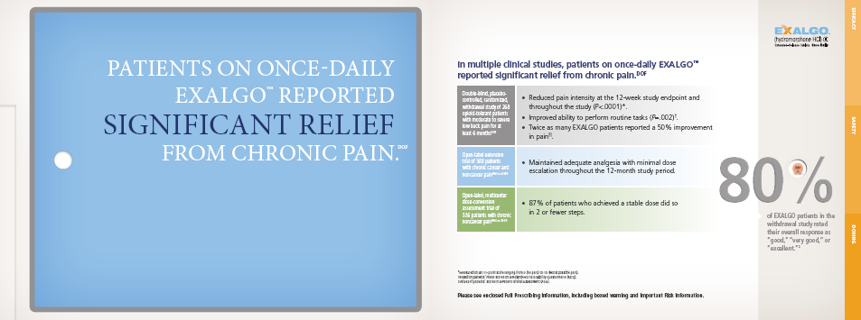
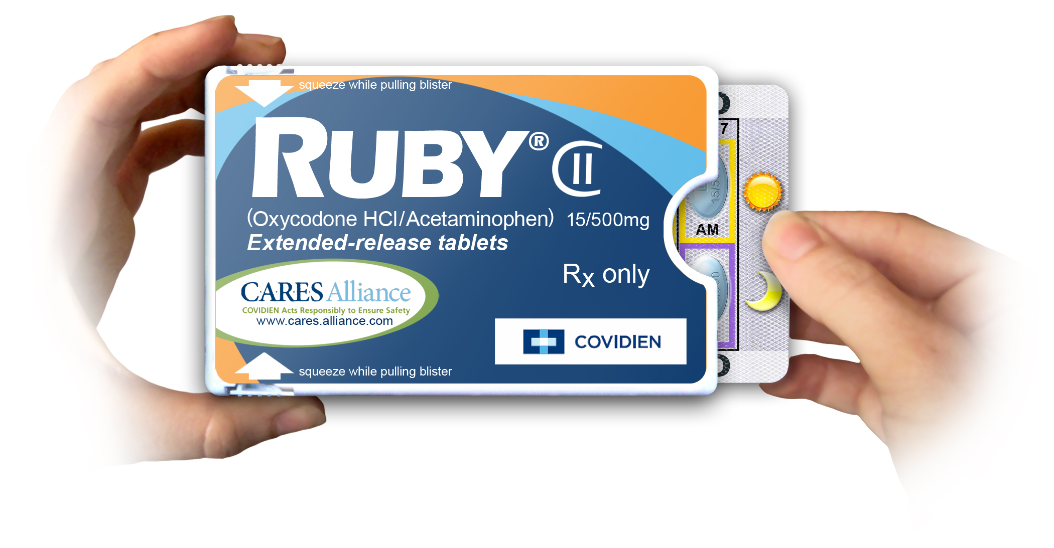
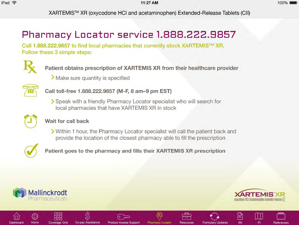
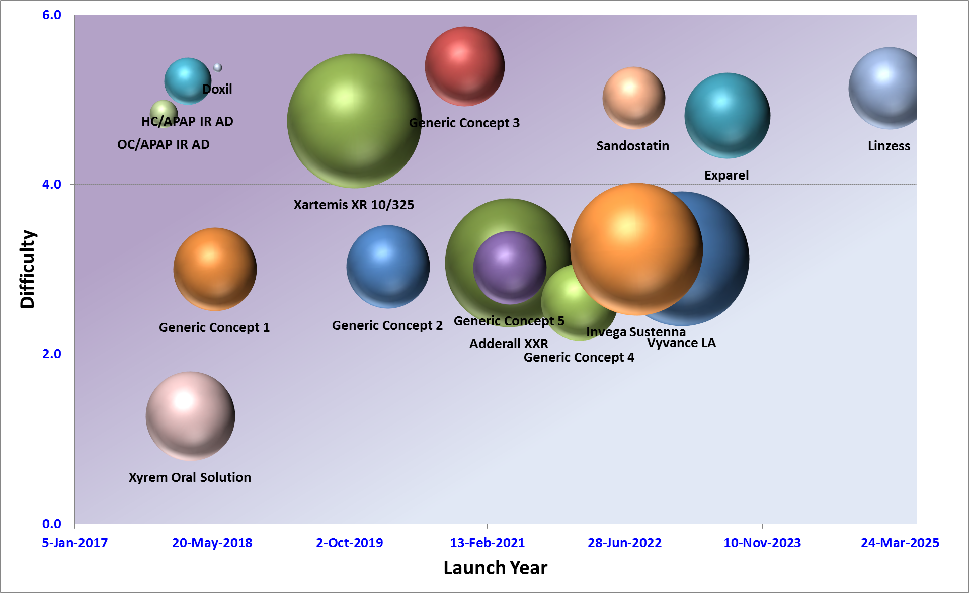
A graph that shows the launch year of a company. The graph is divided into six sections each representing a different company.
The first section is labeled "Difficulty" and shows the number of companies that have launched the company. There are six companies represented in the graph each with a different color - green red orange blue pink purple and purple. The companies are represented by spheres of different sizes and shapes.
Next to each company there is a line graph that compares the difficulty of each company's launch year. The first line graph shows that the company has achieved a high level of difficulty with the highest difficulty being in the top left corner and the lowest difficulty being at the bottom right corner. The second line graph has a list of the companies that were successful in launching the company with each company having a unique design and color scheme. The third line graph also shows that they have experienced a significant increase in their launch year with a slight decrease in the overall effect. The fourth line graph is titled "Xyrem Oral Solution" and has a label that reads "Launch Year".
Overall the graph is a visual representation of the company's success in launching a new product or service.
Category
Source 1 of 2
-
Date
2014
Collection
-
Date
2014
Collection
We encourage you to view the image in the context of its source document(s) and cite the source(s) when using these images. However, to cite just this image alone, click the “Cite This Image” button and then paste the copied text.
