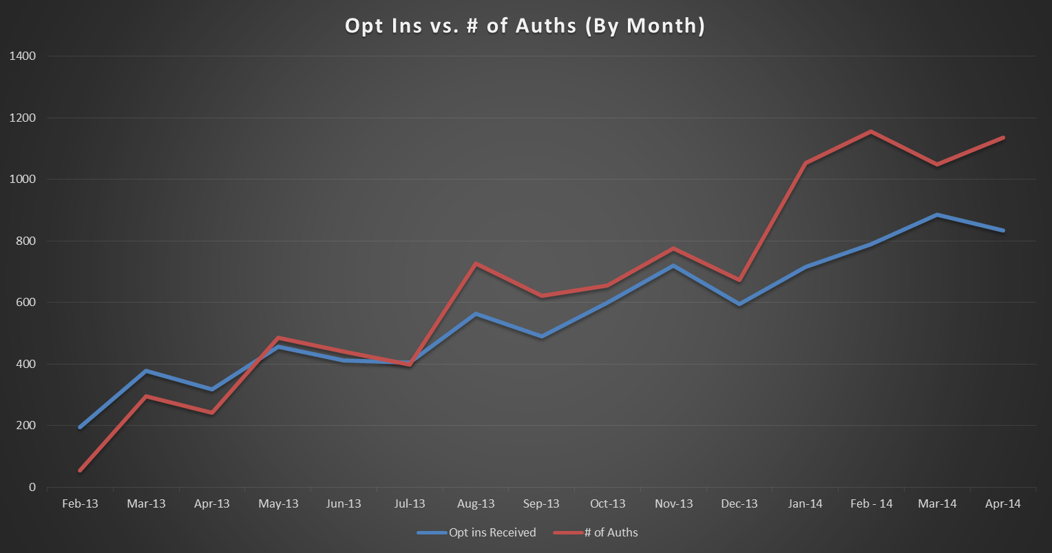
A line graph that shows the number of opt ins vs. # of Auths (By Month) in the United States. The x-axis represents the months of the year starting from February 2013 to April 2014 and gradually increasing from March 2014 to April 2015.
There are three lines in the graph each representing a different period of time. The first line is red the second line is blue and the third line is orange. The red line is slightly higher than the blue line indicating a decrease in opt ins. The blue line is lower than the orange line. The graph shows that opt ins have been steadily increasing over the years with a slight increase in the value of the opt ins over the past few months. The orange line has a slight decrease in value while the red line has an upward trend. The lines are plotted on a black background and there is a legend at the bottom of the graph that explains the meaning of each line.
Category
-
Date
2014
Collection
We encourage you to view the image in the context of its source document(s) and cite the source(s) when using these images. However, to cite just this image alone, click the “Cite This Image” button and then paste the copied text.


