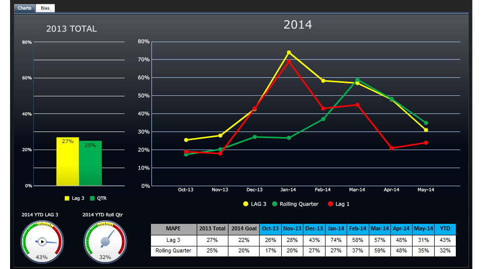
A line graph that shows the number of people who have been diagnosed with cancer in the United States from 2013 to 2014. The x-axis represents the years starting from 2013 and ending in 2014.
The graph has three lines each representing a different period of time. The first line is yellow the second line is green and the third line is red. The lines are plotted in a horizontal axis with the yellow line representing the percentage of people diagnosed with the cancer the green line representing a percentage of the percentage and the red line representing an percentage. The graph also has a legend at the bottom that explains the meaning of each line. The background of the graph is black and there are two gauges on the left side of the image - one for the year 2013 and the other for the month 2014.
Category
-
Date
2014
Collection
We encourage you to view the image in the context of its source document(s) and cite the source(s) when using these images. However, to cite just this image alone, click the “Cite This Image” button and then paste the copied text.
