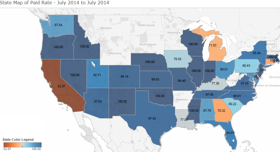
A map of the United States showing the state of paid rate from July 2014 to July 2014. The map is color-coded with each state represented by a different color - blue orange and gray. The blue states represent the percentage of paid rates in each state while the orange states represent percentages in percentage.
The map also shows the state color legend which shows that the states in blue are the highest paid rates for each state. The states in orange are the lowest paid rates with the highest paying rates being around $1000000. The highest paid rate is around $2500000 and the lowest paying rate is about $3500. The lowest paid rate has been around $4500 for the first time in July 2014 with a total of $5500 being around the last time in June 2014. There is also a legend at the bottom of the map that explains the colors used in the map.
Type
Category
Source 1 of 3
-
Date
None
Collection
-
Date
2014
Collection
-
Date
None
Collection
We encourage you to view the image in the context of its source document(s) and cite the source(s) when using these images. However, to cite just this image alone, click the “Cite This Image” button and then paste the copied text.


