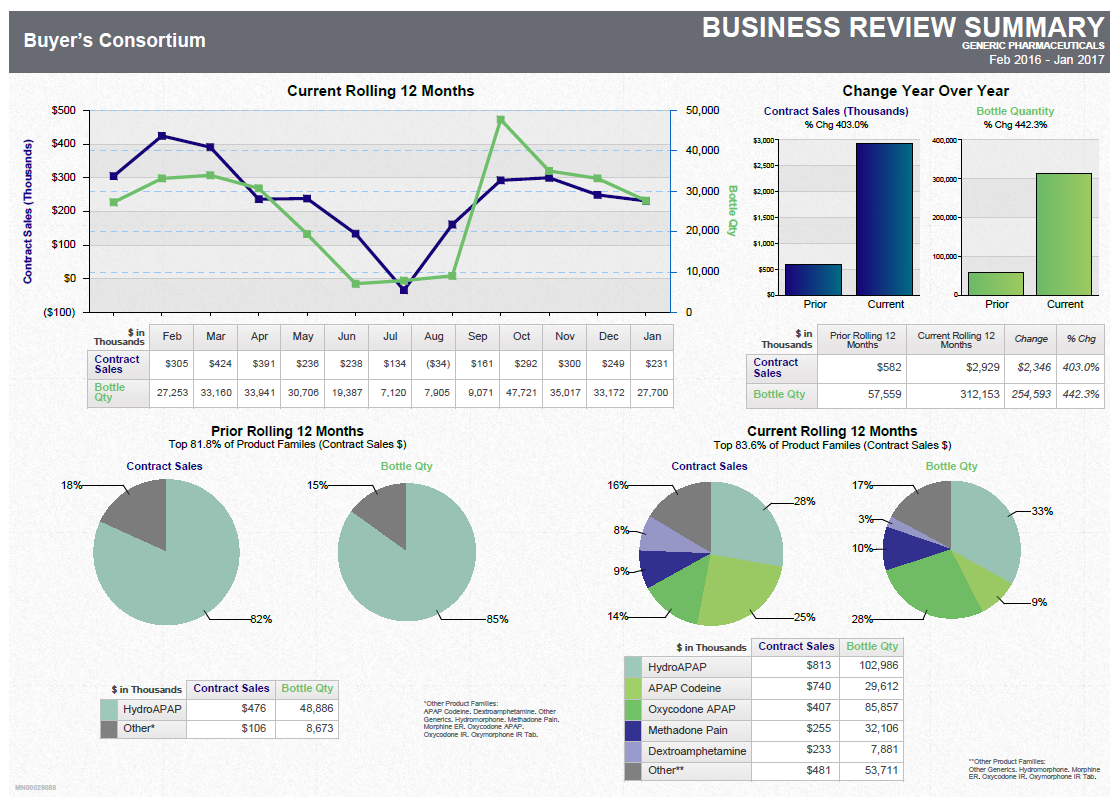
A business review summary for a buyer's consortium. It is divided into three sections.
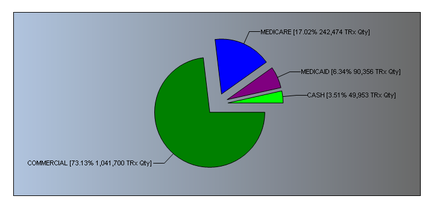
The first section is titled "Buyer's Consortium" and it shows a line graph that shows the current rolling 12 months of the company. The line graph shows that the company has experienced a significant increase in the number of customers over the past 12 months. The graph also shows a bar graph that represents the change in the year over the next 12 months with a blue line representing the percentage of customers who have experienced the increase. The second section is labeled "Change Year Over Year" and shows a green line representing a decrease in the percentage. The third section is labeled "Current Rolling 12 Months" and has a blue pie chart that represents a decrease. The fourth section has a green pie chart and a pink pie chart. The fifth section has two pie charts one showing the percentage change in sales and the other showing the number in sales. The sixth section has three pie charts that show the percentage changes in sales over the years. The seventh section has four pie charts and the eighth section has six pie charts. The ninth section has seven pie charts with different colors representing the different types of sales.
Category
-
Date
2017
Collection
We encourage you to view the image in the context of its source document(s) and cite the source(s) when using these images. However, to cite just this image alone, click the “Cite This Image” button and then paste the copied text.


![An infographic that explains the benefits of full therapeutic value for patients like Patrick. It has a blue background with white text and an illustration of Patrick in the center. The illustration is of a man with his arms crossed and a serious expression on his face. <br /><br />On the left side of the image there is a line graph that shows hours on the x-axis and the pain plasma hydromorphone level on the y-axis demonstrating that "Exalgo remained above 50% of C[?] for more than 90% of dosing interval" as compared to hydromorphone. <br /><br />The right side of the graphic has recommended instructions on how best to treat a patient like Patrick with Exalgo and also has important risk information for Exalgo.](https://oida-resources-images.azureedge.net/public/full/3d05d7df-6b4f-46b4-a36b-ee5f924ecb77.png)



![A screenshot of the Formulary update page of the Xartemis™ XR (oxycodone HCI and acetaminophen Extended-Release Tablets (CII) website. The page has a white background with a green and purple color scheme. The header reads "Formulary update" in bold purple font. Below the header there is a text box that reads "XARTEMIS XR is available unrestricted on Tier 3 for State of Connecticut EMP (CT) Commercial Patients. No PA/Step therapy requirement. Patients will have an average co-pay of [S]." <br /><br />At the bottom of the page there are four buttons each reading "Formulary Update". The website appears to be a mock-up and it appears that some placeholder text exists between brackets.<br /><br />The page also has a navigation bar at the bottom of the page which shows that the "Formulary Updates" section is selected.](https://oida-resources-images.azureedge.net/public/full/c4b34ebc-dbfb-4b3f-b1f4-387298601786.jpeg)
