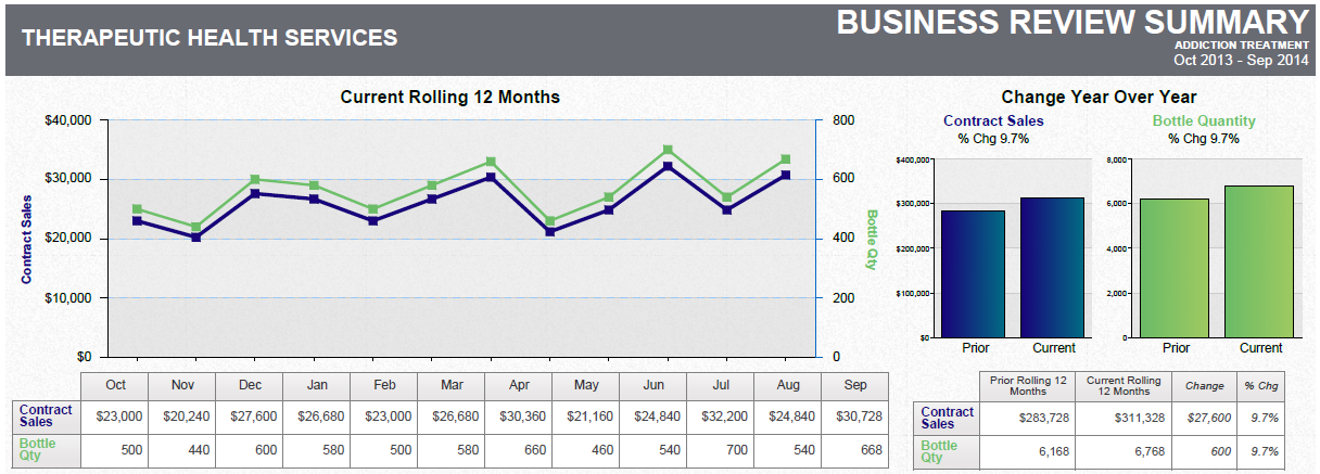
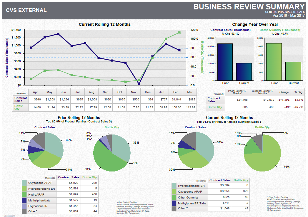
A business review summary template for a company called CVS External. It has a title "Business Review Summary" at the top. Below the title there is a table with three sections.
The first section is titled "Current Rolling 12 Months" and has a line graph that shows the current rolling 12 months of the company. The line graph is blue and shows a steady increase in the number of current rolling months over time. The second section is labeled "Change Year Over Year" and shows the change in the year over the years. The third section has a pie chart that shows that the company has experienced a significant increase in its current rolling rate over the past 12 months. The pie chart is divided into three sections - the first section shows the percentage change in sales the second section shows a decrease in sales growth and the third section shows an increase in revenue growth.
At the bottom of the table there are three circular graphs that show the company's sales growth over time with the largest one in the center and the smallest one on the right side. The graphs are color-coded with blue representing the highest percentage change and green representing the lowest percentage change. The chart also has a legend at the bottom that explains the meaning of each color.
Category
-
Date
2017
Collection
We encourage you to view the image in the context of its source document(s) and cite the source(s) when using these images. However, to cite just this image alone, click the “Cite This Image” button and then paste the copied text.
