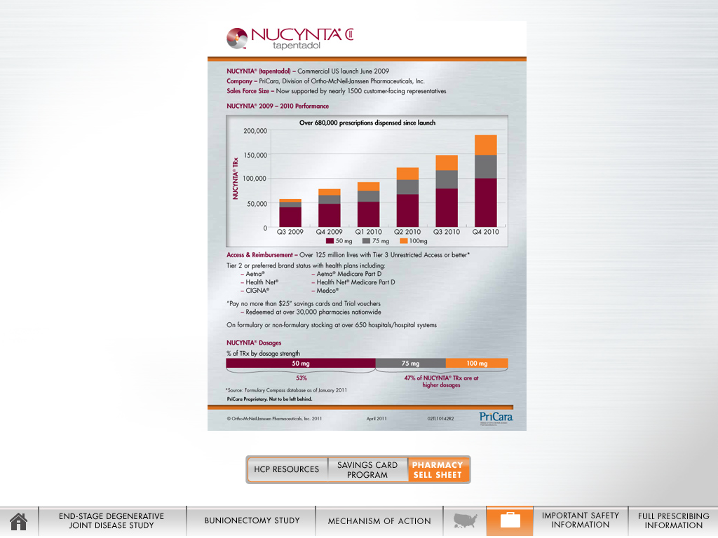
A screenshot from a website or dashboard with information about NUCYNTA sales. The NUCYNTA logo is at the top of the page. Below this there is text indicating that NUCYNTA had a commercial US launch in June 2009 by PriCora and is supported by 1500 customer-facing representatives.
A bar graph is at the center of the page. It is titled "Over 680000 prescriptions dispensed since launch." The x-axis shows quarters between Q3 2009 and Q4 2010. The y-axis shows NUCYNTA TRx. The bars show a steady increase of NUCYNTA prescriptions starting with just over 50000 in Q3 2009 to almost 200000 in Q4 2010. Each bar represents to total of 50 mg 75 mg and 100 mg prescriptions with the 50 mg prescriptions being the most common.
Below the bar graph there is information about access and reimbursement including insurer information. Below this text there is a visualization of what dosages of NUCYNTA are most often prescribed with 50 mg at 53% and 75 mg and 100 mg at 47%.
At the bottom of the page there is a navigation menu. The "Pharmacy Sell Sheet" value appears to be selected.
Description
Category
Source 1 of 2
-
Date
2010
Collection
-
Date
2010
Collection
We encourage you to view the image in the context of its source document(s) and cite the source(s) when using these images. However, to cite just this image alone, click the “Cite This Image” button and then paste the copied text.










![An advertisement that appears to date to the 1950s or 1960s. The title reads "Not just a new package design - the STORMOR bottle is an engineered container for you". Under the title there is a description of Mallinckrodt's design process for the new bottle. On the right side of the page there are three photographs of glass bottles displaying the new features particularly the "concave sides [that] fit your hand". The jars have black lids and white labels reading "Sodium Hydroxide" and are on a green background with a blueprint-like design.](https://oida-resources-images.azureedge.net/public/full/759a9ffc-d601-4091-86dc-45f034261893.jpeg)
