Title
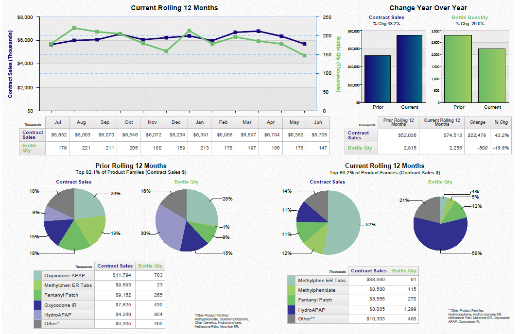
A screenshot of an Excel spreadsheet that shows the current rolling 12 months and the change year over year. The spreadsheet is divided into three sections.
The first section is titled "Current Rolling 12 Months" and has a line graph that shows a steady increase in the number of current rolling months over the past 12 months. The line graph shows a downward trend in the current year indicating a decrease in the amount of change. The second section is labeled "Change Year Over Year" and shows a bar graph that represents the change in the year over the years. The third section has a pie chart that shows that the current rolling 12 months have been steadily increasing over time. The pie chart also shows that there are three pie charts in the chart each representing a different period of time.
There are also three smaller pie charts on the right side of the spreadsheet each with a different color - blue green and purple. The first pie chart is labeled as "Prior Rolling 12 Month" and the second pie chart has a green and blue color scheme. The fourth pie chart shows a blue and green color scheme the fifth pie chart displays a green pie chart with a blue background and the sixth pie chart includes a blue circle with a red background.
There is also a table below the chart that lists the different types of rolling months and their respective percentages. The table also has a legend that explains the meaning of each pie chart.
Category
-
Date
2014
Collection
We encourage you to view the image in the context of its source document(s) and cite the source(s) when using these images. However, to cite just this image alone, click the “Cite This Image” button and then paste the copied text.


