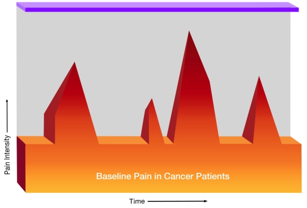
A graph that shows the baseline pain in cancer patients. The x-axis represents the time period while the y-axis indicates the pain intensity.
The graph is divided into three sections each representing a different period of time. The first section is orange the second section is red and the third section is purple. The red section is slightly higher than the orange section indicating a decrease in pain intensity in the patient's pain. The purple section is lower than the red section. The graph also has a label at the bottom that reads "Baseline Pain in Cancer Patients".
Source 1 of 2
-
Date
2012
Collection
-
Date
2012
Collection
We encourage you to view the image in the context of its source document(s) and cite the source(s) when using these images. However, to cite just this image alone, click the “Cite This Image” button and then paste the copied text.


