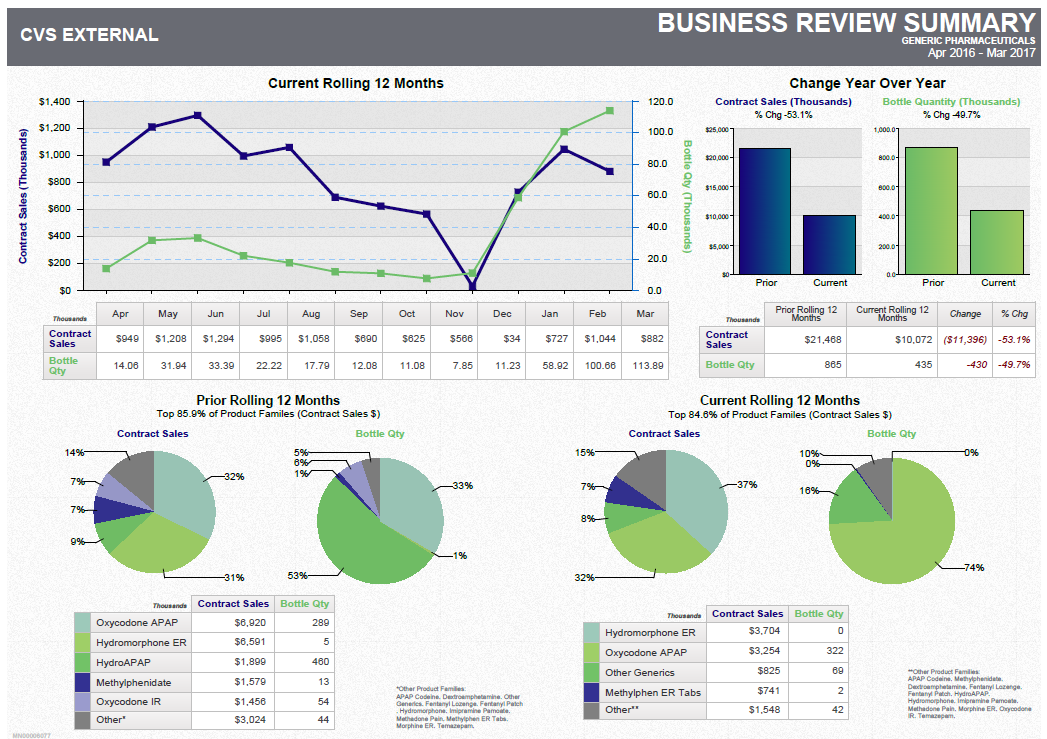
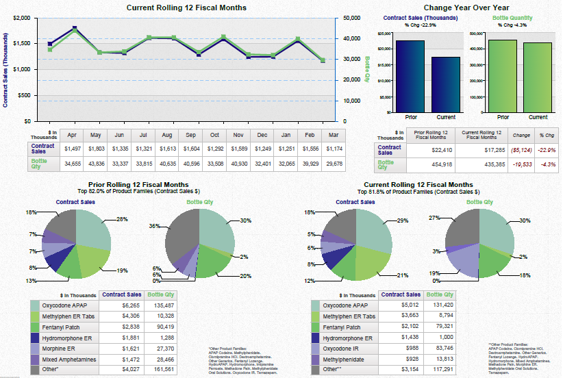
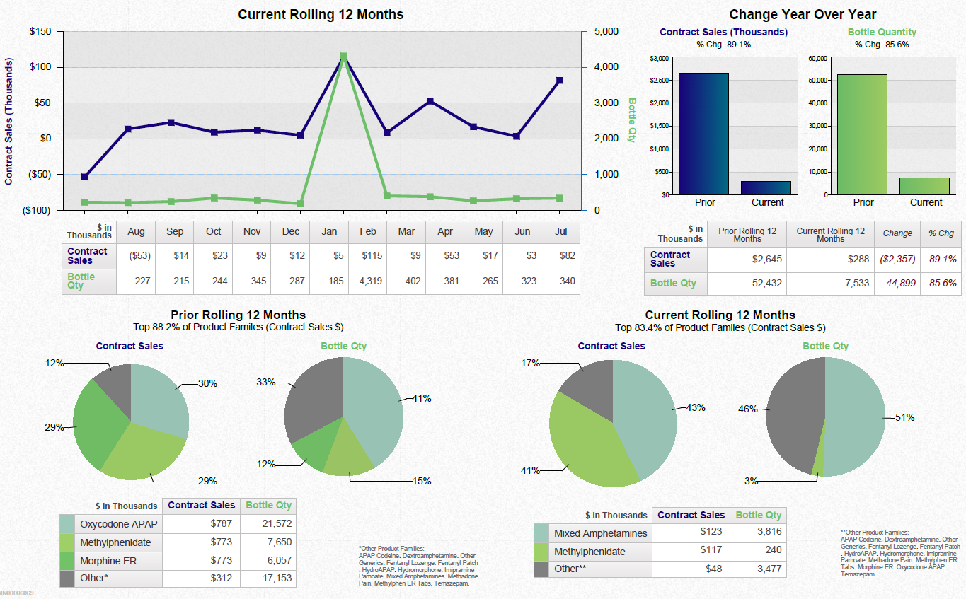
A data visualization. The top section is a run chart comparing the Contract Sales (Thousands) [of dollars] and Bottle Quantity (Thousands) [of bottles] from January to December. The bottom section is the same data - that is Contract Sales and Bottle Quantity in the same units over the same time period. The specific products companies and year are not given. The background is white with graphic elements in blue and green with text in black blue and green.
![A data visualization. The top section is a run chart comparing the Contract Sales (Thousands) [of dollars] and Bottle Quantity (Thousands) [of bottles] from January to December. The bottom section is the same data - that is Contract Sales and Bottle Quantity in the same units over the same time period. The specific products companies and year are not given. The background is white with graphic elements in blue and green with text in black blue and green.](https://oida-resources-images.azureedge.net/public/full/f87f5e3c-a0d9-4257-81d3-c923e279d4dd.png)
Description
Source 1 of 4
-
Date
2015
Collection
-
Date
2015
Collection
-
Date
2012
Collection
-
Date
2015
Collection
We encourage you to view the image in the context of its source document(s) and cite the source(s) when using these images. However, to cite just this image alone, click the “Cite This Image” button and then paste the copied text.


