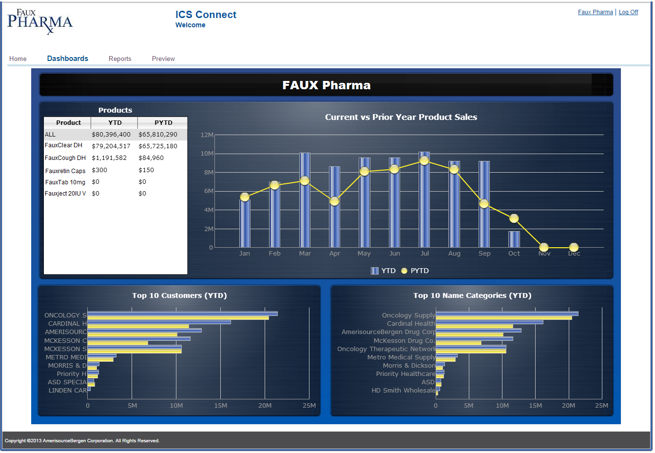
A screenshot of a dashboard titled "FAUX Pharma". On the top half it shows a table labeled "Products" with columns titled "Product" "YTD" and "PYTD". There is a bar graph to its right appearing to plot the data. The bar graph is titled "Current vs. Prior Year Product Sales".
On the bottom half of the dashboard it shows two bar graphs. One is labeled "Top 10 Customers (YTD)" and the other is labeled "Top 10 Name Categories (YTD)".
Category
-
Date
2014
Collection
We encourage you to view the image in the context of its source document(s) and cite the source(s) when using these images. However, to cite just this image alone, click the “Cite This Image” button and then paste the copied text.



![A template for an advertisement reading "XARTEMIS® XR is available unrestricted on [tier #1] for [Plan Name] Commercial Patients. No PA/step therapy requirement. Patients will have an average co-pay of [$]". there are four buttons that each read "[Formulary update]" underneath this text. <br /><br />The page has a white background with a yellow and purple footer. The page also has a navigation bar at the bottom with links to different sections of the website.](https://oidaresourcesimages-cdn-endpoint-duhwc2gse6gdbng7.a01.azurefd.net/public/full/4b087627-0a18-470d-9b0e-38821174cea5.png)
