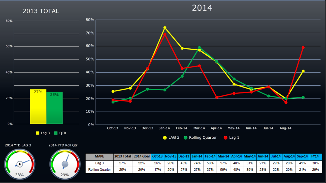
A dashboard. The left side of the dashboard shows a bar graph labeled "2013 Total" with two bars showing values of 27% for Lag 3 and 25% for QTR. Below the bar graph there are two gauges. One is labeled "2014 YTD LAG 3" which shows 38% and the other is "2014 YTD Roll Qtr" which shows 29%. Both gauges go from green to yellow to red. The one on the left points to the red and the one on the right points to where the yellow meets the red.
On the right side of the page there is a line graph labeled "2014". The x-axis shows dates between October 2013 and August 2014. The y-axis shows values between 0% and 80%. There are three lines that represent Lag 1 LAG 3 and Rolling Quarter. There is a table underneath that has the supporting values for the table.
Description
Category
-
Date
2014
Collection
We encourage you to view the image in the context of its source document(s) and cite the source(s) when using these images. However, to cite just this image alone, click the “Cite This Image” button and then paste the copied text.








![A square-shaped sign with a black background and a gold border. In the center of the sign there is a text that reads "My [mustache] brings all the girls to the yard" in white capital letters. Below the text it appears that a photograph of a man's face was inserted into the image so that the man looks like he is wearing a top hat and has a mustache. The man has a big smile on his face and is looking directly at the viewer. The overall design is vintage and whimsical.](https://oida-resources-images.azureedge.net/public/full/58e4efe4-b75d-4966-96ce-2b603919f7ce.jpeg)
