Title
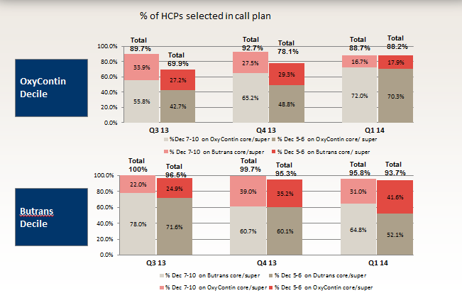
A bar graph that shows the percentage of HCPS selected in call plan for OxyContin Decile. The x-axis of the graph is divided into four sections each representing a different type of call plan.
The first section is labeled "OxyContin Decline" and shows the number of calls selected in the call plan ranging from 0% to 100%. The second section is titled "Total Call Plan" and has a bar chart that shows that the total call plan has been selected from Q1 to Q2. The third section has a list of call plans.
Category
-
Date
2015
Collection
We encourage you to view the image in the context of its source document(s) and cite the source(s) when using these images. However, to cite just this image alone, click the “Cite This Image” button and then paste the copied text.

