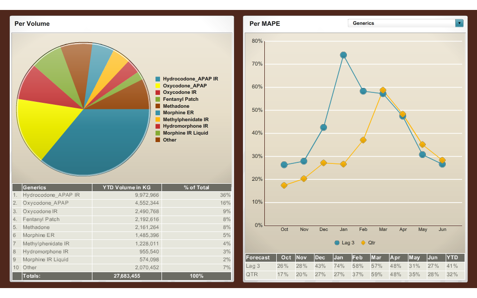
A screenshot of a dashboard. On the left side there is a pie chart titled "Per volume" that shows various opioids. There is a table underneath the pie chart with supporting data. Its columns are labeled "Generics" "YTD Volume in KG" and "% of Total".
On the right side of the dashboard there is a line graph titled "Per MAPE". The x-axis shows different months and the y-axis shows a range of values between 0% and 80%. The lines on the graph represent Leg 3 and Qtr. There is a table of supporting data below the line graph.
Category
-
Date
2014
Collection
We encourage you to view the image in the context of its source document(s) and cite the source(s) when using these images. However, to cite just this image alone, click the “Cite This Image” button and then paste the copied text.

