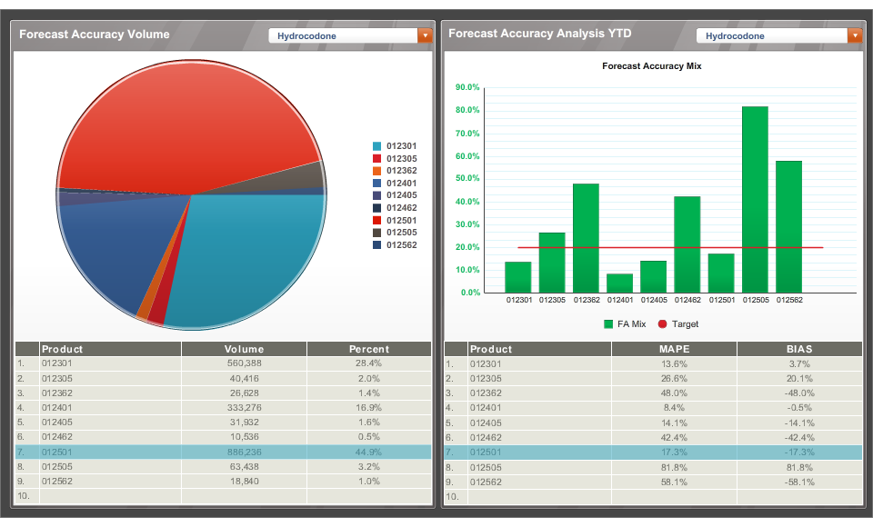
A screenshot of a dashboard with two sections. On the left side there is a pie chart that is titled shows the forecast accuracy volume of hydrocodone. There is a table with supporting data including the product volume and percent underneath the pie chart.
On the right side of the dashboard there is a bar graph showing the forecast accuracy analysis YTD for hydrocodone. There is a table with supporting data including the product MAPE and BIAS underneath the bar chart.
Category
-
Date
2012
Collection
We encourage you to view the image in the context of its source document(s) and cite the source(s) when using these images. However, to cite just this image alone, click the “Cite This Image” button and then paste the copied text.
