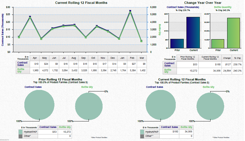
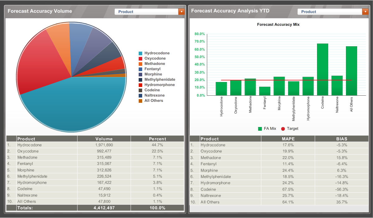
A screenshot of a dashboard with two sections. On the left side there is a pie chart labeled "Forecast accuracy volume." The pie chart is divided into different sections each representing a different product with hydrocodone and oxycodone making up the majority of the chart. There is a table of data showing product volume and percentages under the pie chart.
On the right side of the dashboard there is a bar graph labeled "Forecast Accuracy Analysis YTD" with a subtitle of "Forecast Accuracy Mix". The x-axis shows different drugs and the y-axis shows percentages. Each of the bars are in green over each drug on the x-axis representing the FA mix. A red line goes horizontally across the 20% mark representing the target. There is a table of data showing product MAPE and BIAS below the bar graph.
Category
-
Date
2015
Collection
We encourage you to view the image in the context of its source document(s) and cite the source(s) when using these images. However, to cite just this image alone, click the “Cite This Image” button and then paste the copied text.

