OIDA Image Collection
Filters:
Reset 
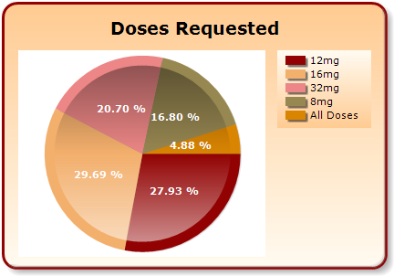
A pie chart that shows the percentage of doses requested. The chart is divided into three sections each representing a different type of medication. The largest section is red the smallest is orange and the largest is yellow.<br /><br />The largest section in the chart is 20.70% the smallest section is 16.80% and the smallest segment is 4.88%. The smallest section has 29.69% the largest section has 27.93% and all the other three sections are orange. The pie chart is labeled "Doses Requested" at the top indicating that the majority of the doses are required for the medication. There is also a label on the right side of the chart that reads "12mg 16mg 32mg 8mg All Doses".

Description Generated using AI

A pie chart that shows the percentage of doses requested. The chart is divided into three sections each representing a different type of medication. The largest section is red the smallest is orange and the largest is yellow.

The largest section in the chart is 20.70% the smallest section is 16.80% and the smallest segment is 4.88%. The smallest section has 29.69% the largest section has 27.93% and all the other three sections are orange. The pie chart is labeled "Doses Requested" at the top indicating that the majority of the doses are required for the medication. There is also a label on the right side of the chart that reads "12mg 16mg 32mg 8mg All Doses".

We encourage you to view the image in the context of its source document(s) and cite the source(s) when using these images. However, to cite just this image alone, click the “Cite This Image” button and then paste the copied text.
Information copied to your clipboard:

"A pie chart that shows the percentage of doses requested. The chart is divided into three sections each representing a different type of medication. ...