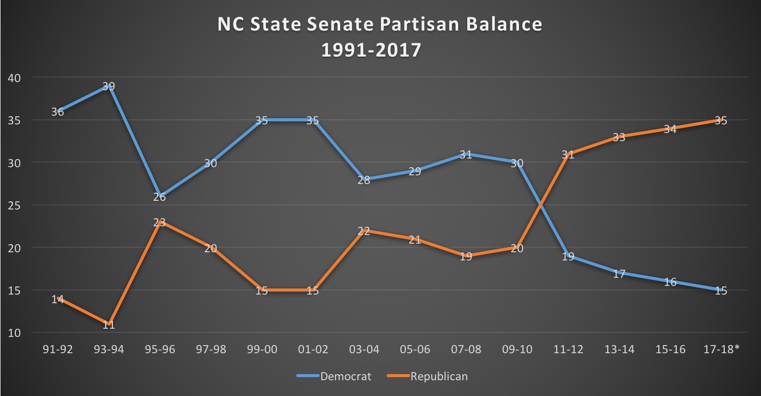
A line graph that shows the NC State Senate Partisan Balance from 1991 to 2017. The x-axis represents the years starting from 1991 and ending in 2017 with the y-axis representing the percentage change in percentage change.
There are three lines in the graph each representing a different period of time. The first line is blue the second line is orange and the third line is red. The lines are plotted in a horizontal axis with each line representing a percentage change from 1991-2017 to 2017-2018. The blue line represents the percentage of percentage change while the orange line represents percentage change between 1991 and 2017.
The line on the left represents the number of people who have voted in the state Senate ranging from 0 to 100%. The line in the middle represents the Democratic and Republican parties respectively. The line at the bottom of the graph shows that the majority of people voted in each period of the year with 91-92 being the highest percentage change and 93-94 being the lowest. The graph also shows that there is a significant increase in percentage changes between the two parties.
-
Date
2016
Collection
We encourage you to view the image in the context of its source document(s) and cite the source(s) when using these images. However, to cite just this image alone, click the “Cite This Image” button and then paste the copied text.

