OIDA Image Collection
Filters:
Reset 
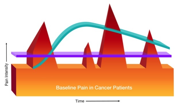
A graph that shows the relationship between baseline pain in cancer patients and pain intensity. The graph is divided into three sections each representing a different stage of the pain.<br /><br />The first section is labeled "Pain Intensity" and shows a red triangle on the left side of the graph. The second section is titled "Baseline Pain in Cancer Patients" and has a blue line that goes from the top left corner to the bottom right corner. The third section is labeled "Time" and is represented by a purple line. The blue line represents the pain intensity of the patients while the red line represents pain intensity from the bottom left corner indicating that the pain is higher than the blue line. <br /><br />Overall the graph shows that baseline pain can be caused by a variety of factors such as pain inflammation and inflammation in the body and that it can affect the overall health and well-being of those affected by cancer patients.

Description Generated using AI

A graph that shows the relationship between baseline pain in cancer patients and pain intensity. The graph is divided into three sections each representing a different stage of the pain.

The first section is labeled "Pain Intensity" and shows a red triangle on the left side of the graph. The second section is titled "Baseline Pain in Cancer Patients" and has a blue line that goes from the top left corner to the bottom right corner. The third section is labeled "Time" and is represented by a purple line. The blue line represents the pain intensity of the patients while the red line represents pain intensity from the bottom left corner indicating that the pain is higher than the blue line.

Overall the graph shows that baseline pain can be caused by a variety of factors such as pain inflammation and inflammation in the body and that it can affect the overall health and well-being of those affected by cancer patients.

Category Generated using AI

We encourage you to view the image in the context of its source document(s) and cite the source(s) when using these images. However, to cite just this image alone, click the “Cite This Image” button and then paste the copied text.

Information copied to your clipboard:

"A graph that shows the relationship between baseline pain in cancer patients and pain intensity. The graph is divided into three sections each repres...