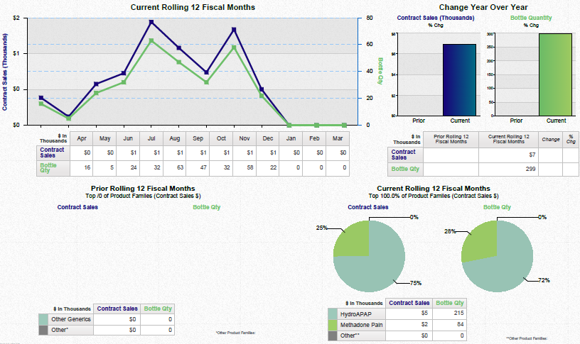
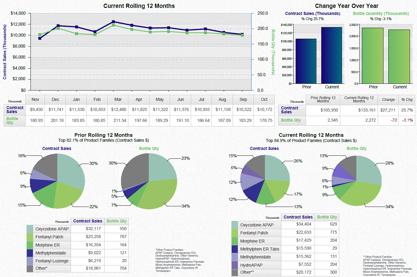
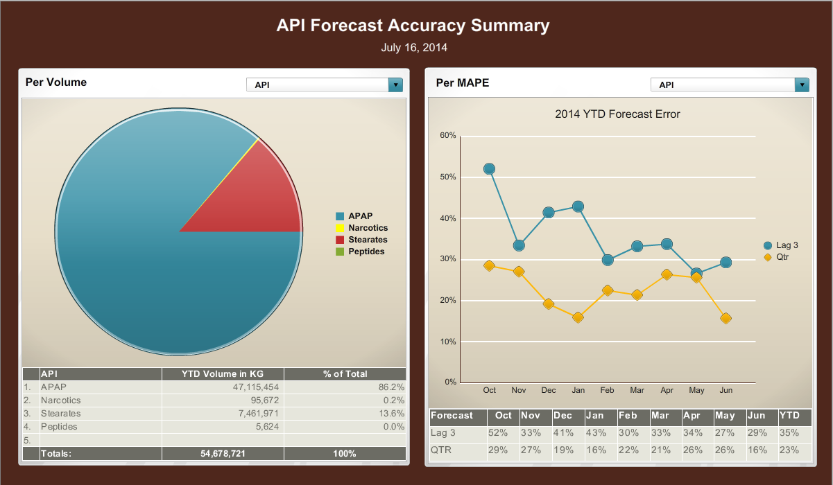
A screenshot of the API Forecast Accuracy Summary page in a software application. The page is divided into two sections.
On the left side of the page there is a pie chart that shows the percentage of API volumes in the United States. The pie chart is blue and red in color with the largest section representing the percentage and the smallest section representing a percentage. The chart shows that the API volumes have been steadily increasing over time with some areas having a higher percentage than others.
In the middle section there are two graphs one in blue and one in orange. The blue graph shows a line graph with a downward trend while the orange graph shows an upward trend. The line graph shows the 2014 YTD forecast error which is represented by a yellow line. The graph also shows a blue line that shows a decrease in the percentage indicating a decrease over time. The text on the page provides further information about the data such as the date time and location of the data.
Category
-
Date
2014
Collection
We encourage you to view the image in the context of its source document(s) and cite the source(s) when using these images. However, to cite just this image alone, click the “Cite This Image” button and then paste the copied text.

