Title
A bar graph that shows the number of hydrocodone and oxycodone concentrations in the United States from 1991 to 2013. The x-axis represents the years starting from 1991 and ending in 2013 with the y-axis representing the amount of concentrations.
There are three bars in the graph each representing a different year. The first bar is labeled "Total" and shows the total concentrations of the two substances. The second bar is colored in red indicating that the concentrations are higher than the third bar. The third bar is color-coded with blue representing the highest concentrations and green representing the lowest concentrations. The fourth bar is blue representing a lower concentration. The fifth bar is orange representing a higher concentration indicating a higher level of concentration.
The graph also has a legend at the bottom that explains the meaning of each color in the bars. The bars are arranged in ascending order with each bar representing a year from 1991 through 2013.
Category
Source 1 of 2
-
Date
2016
Collection
-
Date
2016
Collection
We encourage you to view the image in the context of its source document(s) and cite the source(s) when using these images. However, to cite just this image alone, click the “Cite This Image” button and then paste the copied text.



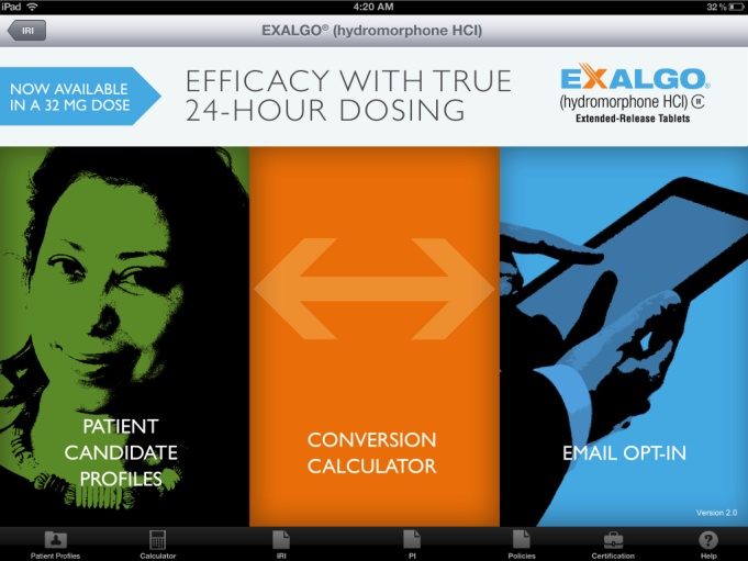
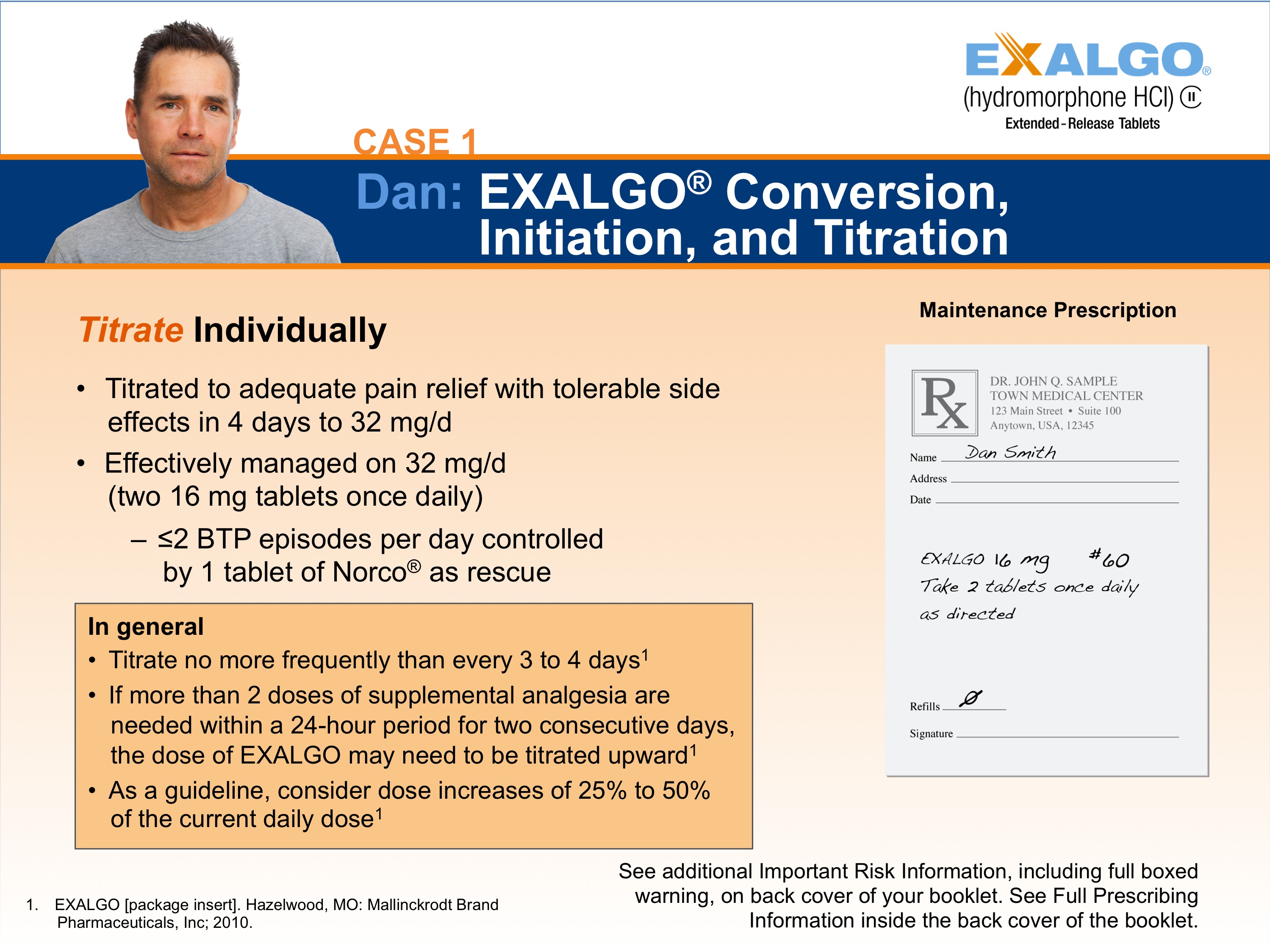
![A screenshot from the Exalgo website. It appears to show case studies for how to convert different example patients to Exalgo step-by-step. The website is of example patient Dennis and the "Dose Conversion" step is selected. The website has a blue and white color scheme with a blue header and black footer.<br /><br />The main text of the page reads "Exalgo could give Dennis the pain relief he wants - with a once-daily dose. Double-blind placebo-controlled withdrawal study of opioid-tolerant patients with low back pain (447 enrolled 268 randomized; 66[49%] EXALGO patients and 44 [31%) placebo patients completed the study". Below that there is additional text that reads "Conversion/Titration Phase: EXALGO reduced mean pain intensity (NRS*) by 50% in successfully converted patients". <br /><br />The bottom of the page also has indication and important risk information. In the lower right corner there is an image of a person walking a dog on a leash with a tree in the background. The footer has the Exalgo logo and a navigation menu.](https://oidaresourcesimages-cdn-endpoint-duhwc2gse6gdbng7.a01.azurefd.net/public/full/788d6c94-1a49-4186-9b61-4e458d11f420.png)
