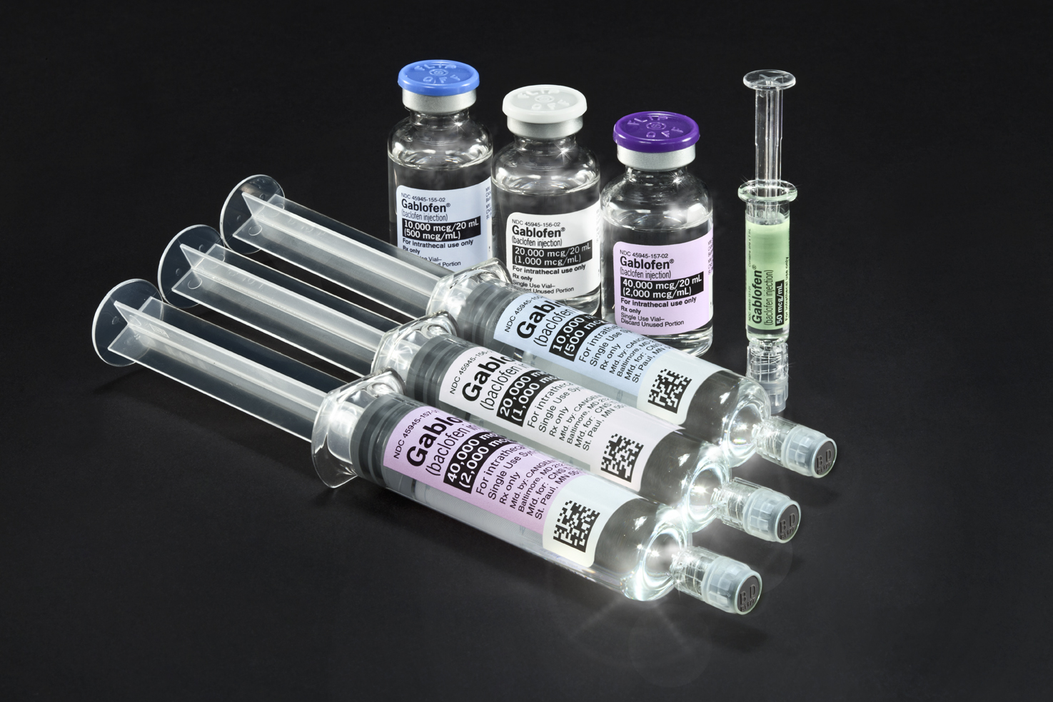
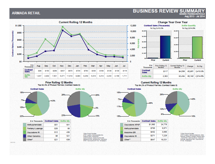
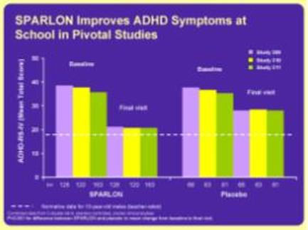
A bar graph that shows the percentage of students who have improved add symptoms at school in Pivotal Studies. The x-axis of the graph is labeled "pardon" and the y-axis is labeled with the number of students. There are six bars in the graph each representing a different type of add. The first bar represents the percentage change in the percentage the second bar represents a percentage change the third bar represents an increase in the number and the fourth bar represents another percentage change. The bars are arranged in a horizontal axis with the highest percentage change at the top and the lowest at the bottom. The highest percentage is in the first bar followed by the lowest percentage in the second and third bars. The lowest percentage is at the middle with a percentage decrease in the third and fourth bars. The graph also has a legend that explains the meaning of each bar. The background of the image is purple and there is text on the top right corner that reads "pardon Improves add Symptoms at School in PIVOTAL Studies".

Category
Source 1 of 2
-
Date
2010
Collection
-
Date
2010
Collection
We encourage you to view the image in the context of its source document(s) and cite the source(s) when using these images. However, to cite just this image alone, click the “Cite This Image” button and then paste the copied text.