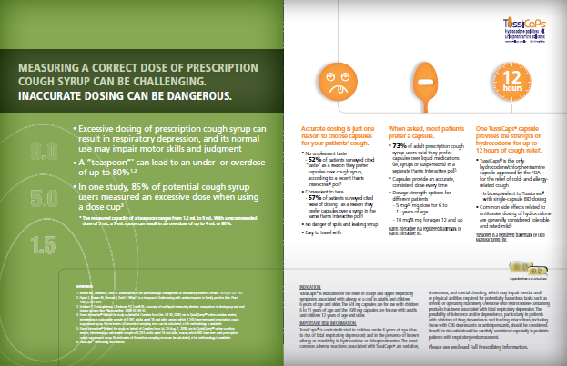


Title
Description
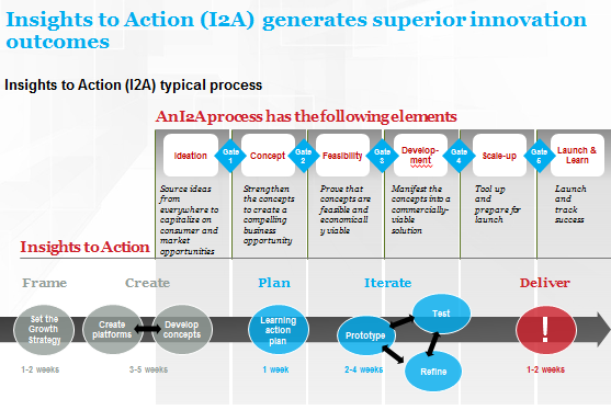
This is a graph showing the relationship between Cost and ROI (Return on Investment) over Time. Time is on the x-axis Cost is on the y-axis (left side) and ROI is on the y-axis (right side). It shows that Cost is high initially before declining over Time whereas ROI is low initially before rising over Time.
Type 
Category
Source 1 of 2
-
Date
2015
Collection
-
Date
2015
Collection
We encourage you to view the image in the context of its source document(s) and cite the source(s) when using these images. However, to cite just this image alone, click the “Cite This Image” button and then paste the copied text.