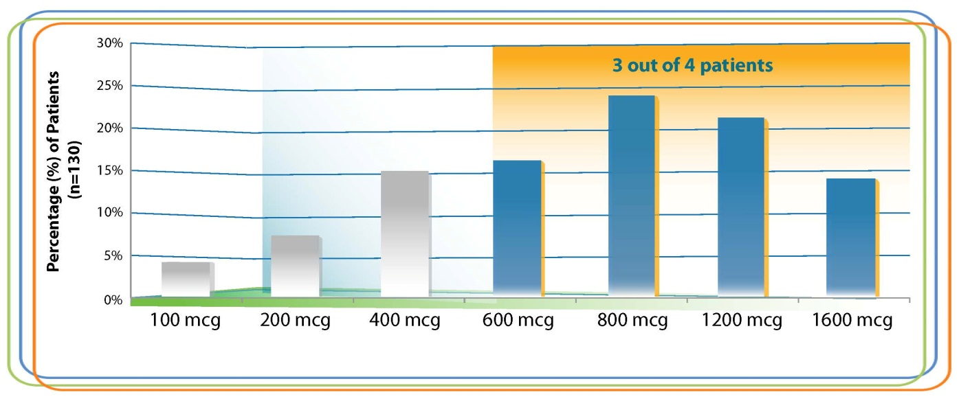
An untitled bar graph. The x-axis of the graph shows different dosages between 100 mcg and 1600 mcg and the y-axis shows percentage of patients (n=130) with values between 0% and 30%. The four highest dosages are highlighted in orange and that section of the graph is titled "3 out of 4 patients".
Description
Category
Source 1 of 84
-
Date
2012
Collection
-
Date
2013
Collection
-
Date
2012
Collection
-
Date
2012
Collection
-
Date
2012
Collection
-
Date
2014
Collection
-
Date
2012
Collection
-
Date
2012
Collection
-
Date
2012
Collection
-
Date
2013
Collection
-
Date
2012
Collection
-
Date
2012
Collection
-
Date
2012
Collection
-
Date
2014
Collection
-
Date
2012
Collection
-
Date
2013
Collection
-
Date
2013
Collection
-
Date
2012
Collection
-
Date
2014
Collection
-
Date
2013
Collection
-
Date
2013
Collection
-
Date
2012
Collection
-
Date
2012
Collection
-
Date
2012
Collection
-
Date
2012
Collection
-
Date
2012
Collection
-
Date
2013
Collection
-
Date
2012
Collection
-
Date
2013
Collection
-
Date
2012
Collection
-
Date
2012
Collection
-
Date
2012
Collection
-
Date
2012
Collection
-
Date
2014
Collection
-
Date
2012
Collection
-
Date
2012
Collection
-
Date
2012
Collection
-
Date
2013
Collection
-
Date
2014
Collection
-
Date
2012
Collection
-
Date
2012
Collection
-
Date
2012
Collection
-
Date
2012
Collection
-
Date
2012
Collection
-
Date
2012
Collection
-
Date
2012
Collection
-
Date
2012
Collection
-
Date
2014
Collection
-
Date
2012
Collection
-
Date
2012
Collection
-
Date
2012
Collection
-
Date
2012
Collection
-
Date
2012
Collection
-
Date
2013
Collection
-
Date
2013
Collection
-
Date
2012
Collection
-
Date
2012
Collection
-
Date
2013
Collection
-
Date
2012
Collection
-
Date
2013
Collection
-
Date
2012
Collection
-
Date
2012
Collection
-
Date
2012
Collection
-
Date
2012
Collection
-
Date
2012
Collection
-
Date
2012
Collection
-
Date
2014
Collection
-
Date
2012
Collection
-
Date
2013
Collection
-
Date
2012
Collection
-
Date
2012
Collection
-
Date
2014
Collection
-
Date
2013
Collection
-
Date
2012
Collection
-
Date
2014
Collection
-
Date
2014
Collection
-
Date
2012
Collection
-
Date
2012
Collection
-
Date
2012
Collection
-
Date
2012
Collection
-
Date
2012
Collection
-
Date
2012
Collection
-
Date
2012
Collection
-
Date
2012
Collection
We encourage you to view the image in the context of its source document(s) and cite the source(s) when using these images. However, to cite just this image alone, click the “Cite This Image” button and then paste the copied text.









![A flow chart describing the pain management process from a physician's perspective in 5 sections accompanied by 7 annotations (marked by stars pointing to text boxes). The sections are Origin Evaluation and Diagnosis Treatment Choices [something to do with insurance coverage for prescriptions?] and Persistency. The annotations appear to refer to ways that Mallinckrodt Pharmaceuticals could increase the awareness sales and profitability of Exalgo. The background is white with graphic elements in blue gray green and yellow with text in black red and green.](https://oida-resources-images.azureedge.net/public/full/c3a89e52-3266-47c0-9ed9-fe67133608e2.png)


