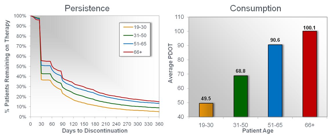
A data visualization consisting of a run chart (with the title "Persistence") and a bar graph (with the title "Consumption"). The run chart shows the Percentage of Patients Remaining on Therapy (on the y-axis spanning from 0% to 100%) compared to their Days to Discontinuation (on the x-axis spanning from 0 days to 360 days). It compares patients by age ranges : 19-30 years old (in orange) 31-50 years old (in green) 51-65 years old (in blue) and 66+ years old (in red). The data shows that many patients discontinue treatment after the first 30 days then trend steadily downwards for the next 11 months. The bar graph shows the Average Patient Days of Treatment (a.k.a. PDOT on the y-axis spanning from 40 to 100) for the same 4 age ranges mentioned previously. The data shows that patients between 19-30 years old have the lowest average PDOT (49.5 days) and patients over 65 years old have the highest average PDOT (100.1 days). The background is white and gray with graphic elements in orange green blue and red with text in black.
Description
Category
Source 1 of 4
-
Date
2012
Collection
-
Date
2012
Collection
-
Date
2012
Collection
-
Date
2012
Collection
We encourage you to view the image in the context of its source document(s) and cite the source(s) when using these images. However, to cite just this image alone, click the “Cite This Image” button and then paste the copied text.

![Information about NUCYNTA ER. It is titled "NUCYNTA ER: better GI tolerability than oxycodone CR in a 1-year safety study". There is a bar graph at the center of the image titled "Incidence of the treatment-emergent adverse events reported [...] treatment group in a 52-week study (osteoarthritis[...]". The x-axis values between 0 and 40. The y-axis has a number of adverse events. The graph shows that NUCYNTA ER had a lower incidence of adverse events than Oxycodone for nausea vomiting constipation dizziness and skin pruritus (itching). It shows that Oxycodone had a lower incidence of adverse events for diarrhea dry mouth somnolence and headache. They show equal values for fatigue. The bars for nausea vomiting and constipation are at the top of the graph and they are highlighted in brighter colors. An arrow points to these bars and is labeled "50% lower incidence of nausea vomiting and constipation vs. oxycodone CR". <br /><br />The image also shows a red side bar with the NUCYNTA ER logo and selected important safety information.](https://oida-resources-images.azureedge.net/public/full/bdae85ed-5038-4ac0-8738-b5232296aa03.jpg)
