Title
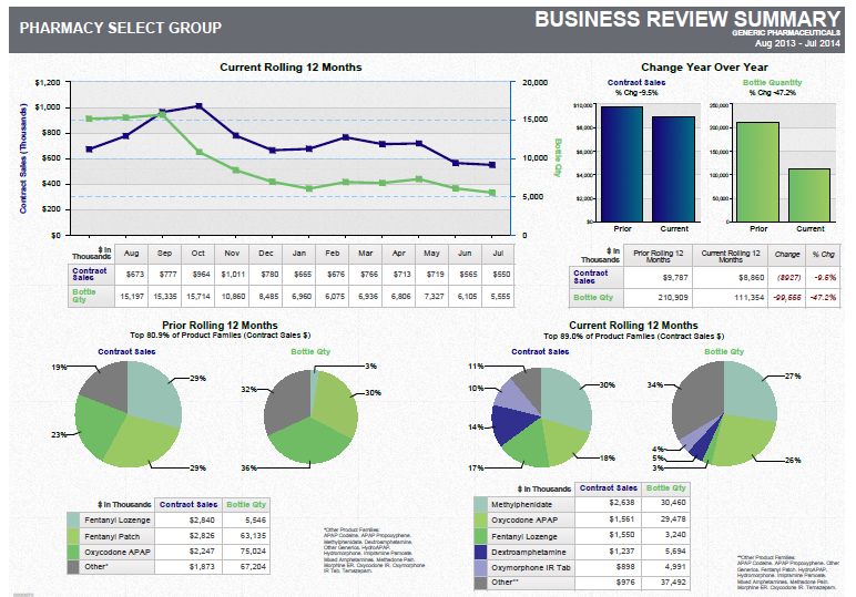
A business review summary for a pharmacy select group. It is divided into three sections - the first section is titled "Pharmacy Select Group" and the second section is labeled "Business Review Summary".
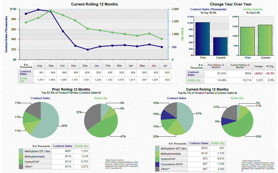
The first section has a line graph that shows the current rolling 12 months of the pharmacy. The line graph shows that the pharmacy has experienced a significant increase in the number of customers in the past 12 months. The second section has two graphs one in blue and one in green that show the change in the year over the years. The third section is a pie chart that shows a decrease in the percentage of customers who have received a purchase from the pharmacy with the highest percentage being in the first quarter of the year and the lowest percentage being on the second quarter.
There are also three pie charts in the image each with a different color - green blue and pink. The green pie chart shows a percentage increase in sales the blue pie chart displays a decrease and the pink pie chart indicates a decrease. The pie chart also shows a decline in sales from the last quarter to the next quarter with a slight decrease in sales. The chart is accompanied by a table that provides further details about the business review.
Category
Source 1 of 2
-
Date
2012
Collection
-
Date
2014
Collection
We encourage you to view the image in the context of its source document(s) and cite the source(s) when using these images. However, to cite just this image alone, click the “Cite This Image” button and then paste the copied text.






![A screenshot from the Exalgo website. It appears to show case studies for how to convert different example patients to Exalgo step-by-step. The website is of example patient Dennis and the "Dose Conversion" step is selected. The website has a blue and white color scheme with a blue header and black footer.<br /><br />The main text of the page reads "Converting Dennis to EXALGO" Below that there are three steps outlining how to do so with each step having a header. The headers read: "1. Calculate the approximate oral hydromorphone equivalent of current opioid using the EXALGO conversion table."; "2. Choose a starting dose after considering [a number of criteria]"; "3. Individualize the dose once therapy is initiated by assessing pain relief and adverse reactions".<br /><br />The bottom of the page also has important risk information. In the lower right corner there is an image of a person walking a dog on a leash with a tree in the background. The footer has the Exalgo logo and a navigation menu.](https://oidaresourcesimages-cdn-endpoint-duhwc2gse6gdbng7.a01.azurefd.net/public/full/c8807596-1516-4cd3-b01e-55d6d0d5828c.png)
