Title
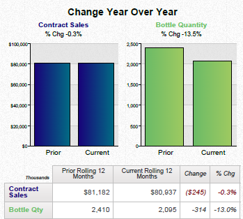
A bar graph that shows the change year over year for contract sales and bottle quantity. The x-axis of the graph is labeled "Contract Sales" and the y-axis is labeled as "Bottle Quantity".
There are two bars in the graph one in blue and one in green. The blue bar represents contract sales while the green bar represents current sales.
The graph shows that contract sales have increased from $100000 to $80000 in the first quarter of the year with a slight increase in the second quarter. The current sales have decreased from $81182 in the third quarter with an increase of $80.937 in the fourth quarter and a decrease of $245 in the fifth quarter. There is also a note at the bottom of the chart that reads "2410".
Overall the graph shows a downward trend in contract sales over the years indicating a decrease in the Bottle Quantity.
Category
Source 1 of 2
-
Date
2015
Collection
-
Date
2015
Collection
We encourage you to view the image in the context of its source document(s) and cite the source(s) when using these images. However, to cite just this image alone, click the “Cite This Image” button and then paste the copied text.

